From PictureMan to CaptureDat: A Rebrand & Rebuild
New Orleans photographer Dominique McClennan has a unique business printing photos of event attendees on demand. Several years ago I built and created a brand identity for a web application and mobile app to enable him to post photos to event web pages and send photos to event attendees in real time. Recently he wanted to change his company name and branding, and to redesign the mobile app to support changed corporate goals.
Process
The client wanted a new look that focused on people, and better showed the diversity of his clientele. He also wanted a logo that would convey the concept of photos, and tie it in with mobile devices. I created a brand identity to achieve those goals.
His existing brand identity had been created "just to have something", and looked like this:
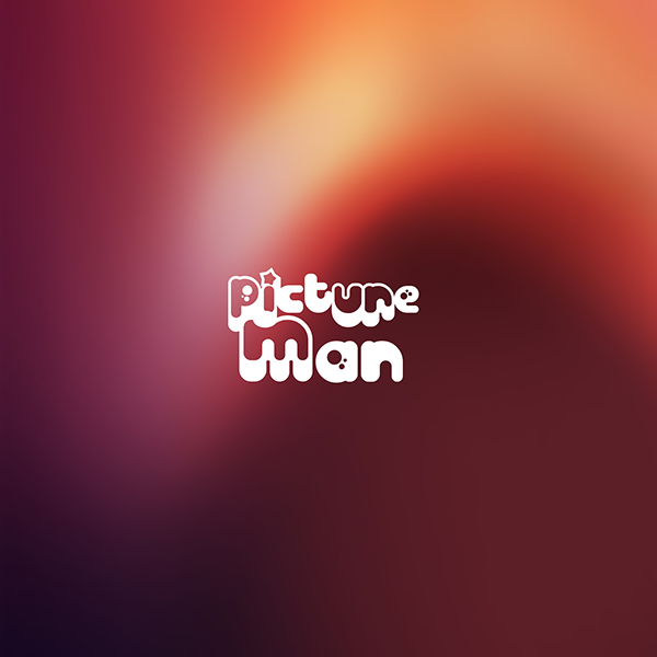
Previous Logo

Previous Icon
It had a "fun" quality, but not much else going on.
In addition, he had changed his target market to be corporate event managers. The concept now would target their event production teams, so it has to be simple, with a shallow learning curve.
As the budget was (is) exceedingly frugal, I started generating design ideas and graphic concepts using MidJourney AI.
AI Logo Generation
This began with a simple prompt...
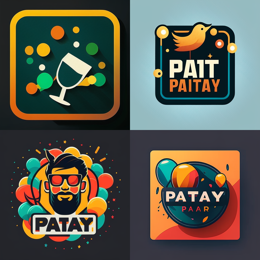
a flat vector logo for a party photo app
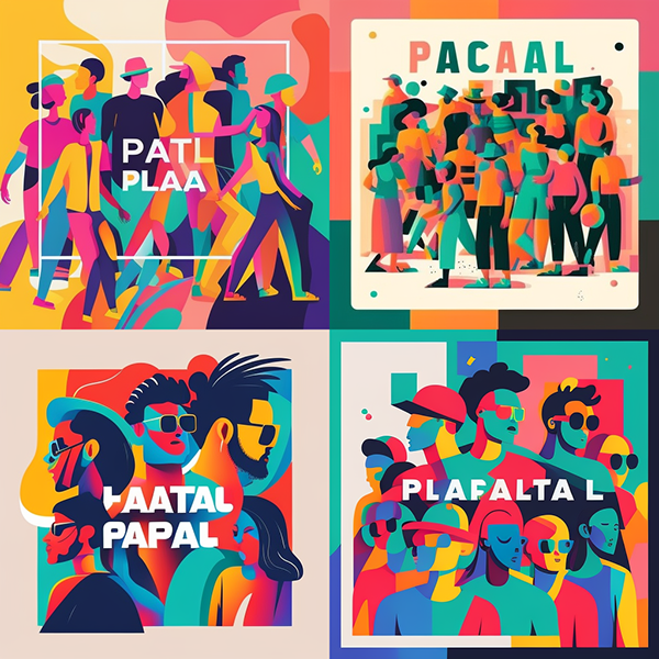
...which generated not particularly compelling results:
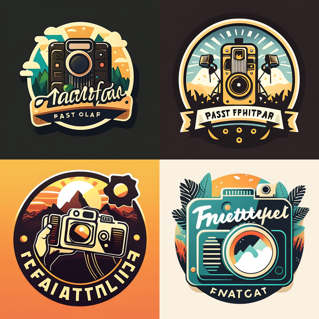
I next attempted a few variations to see what the service might generate for different kinds of events, such as a music event...
a flat vector logo for a music festival photographer app
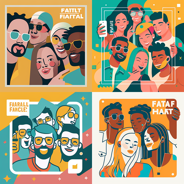
...and a "photo exhibition" event...

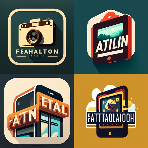
I felt the bottom right concept had some promise. I liked the mobile phone concept with the text overlay, and I found the colors unusual. Perhaps this could work with something in the phone screen area, maybe a diverse group of people having fun?
square logo of multiracial people at party having fun posing, music festival, colorful flat vector art
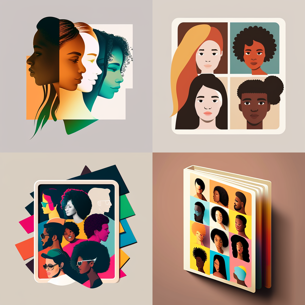
Hmm, now we are getting somewhere! Not quite, but I see some promise. Let's try some variations of number 3 (bottom left):
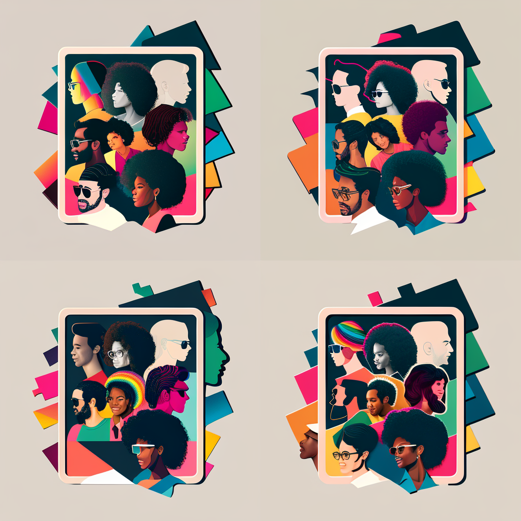
Some elements I liked about this one: The photo framing, the 3/4 profiles, and the colorful aspect. The faces seemed too detailed for a tiny part of a logo though. I fiddled some more...
and a final, or close-to-final, version of the logo (I've created different versions for use as icons and other assets):
User Experience Design (UXD) and Mobile App Design Process
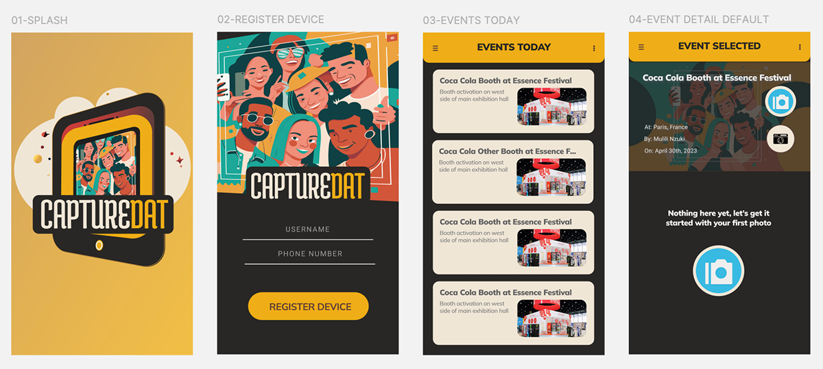
Once we had a look and feel he liked, I then moved on to the user experience design (UX) of a revamped mobile app using Figma and Adobe Creative Suite. I designed high-fidelity screens based on existing UX use case documents I had prepared earlier. The designs were then exported from Figma and sent to a developer.
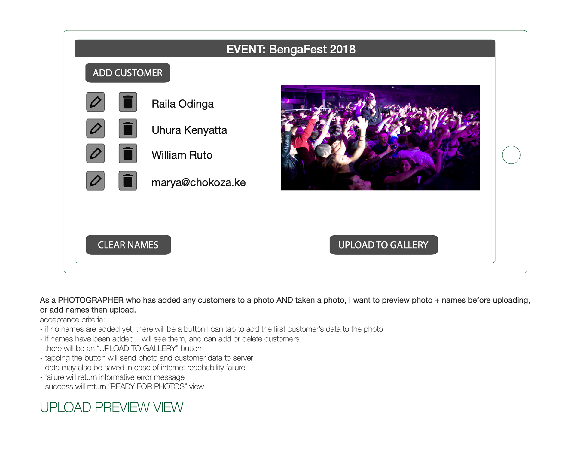
I won't go through all the use cases and individual screens, but many of them are visible in these screen exports from Figma:


Outcome & Impacts
The app is currently in the later stages of development. I hope to launch version 1.0 this fall.
External Sources
Images in this report come either from revzilla.com, pinterest.com, or were created by the author using MidJourney's AI image generator.